Author Thread Comments Made During the Challenge
Post actions
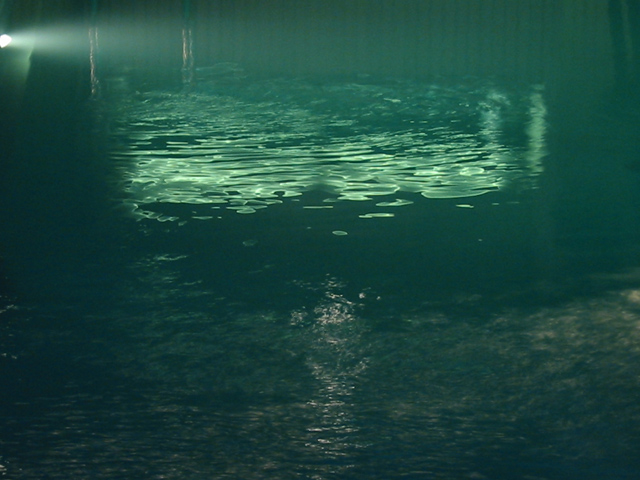
I like this one, but I would have played with the levels to put more of a blue cast into the water. It looks more green than blue to me.
Post actions
There is nothing captivating with this shot.
Post actions
My moniter is fine, but this photo is green and it doesn't make me feel , think, or see blue. It'ls just a nice night picture of the water. PTL5
Post actions
Wish you could have cropped out the actual light, on the left side.
Post actions
More green than blue, but I can't help but like it...
Post actions
nothing interesting in this photo. no apparent subject.
Post actions
wish the photo were more blue...less green. i also wonder what that little light is that is off to the left. there is no real focus here, however i like the concept.
Post actions
Post actions
Post actions
Looks pretty green to me... and the name makes me think of a deep dark (black) whole. Interesting idea, but nothing is really clear here.
Post actions
I like the ripple effect, but the photo is a little too obscure.
Post actions
Pretty just looks a little empty. The color, mood and general feeling is nice. Justine
Post actions
This would have looked better if the lightsource wasn't visible. And if the hue was changed to be bluer.
Post actions
green works... blueness is deeper than color... sorry for the pun on your title...
Post actions
cropped differently, this could be a fantastic shot. the bright part of the water in the upper center needs to touch the edges. it's too disjoint otherwise. i would have cropped it vertically, in the 427x640 format, and hoped the enlarging did not mess up the quality.






 Add photograph to your favorites
 Add photographer to your favorites


