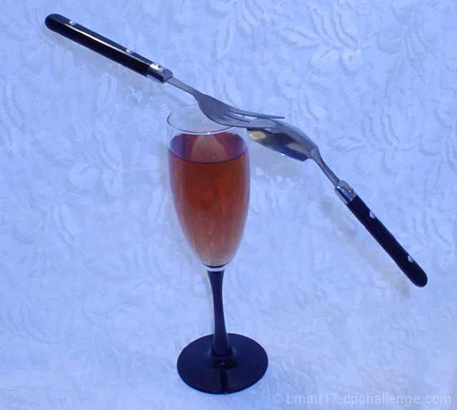
Shot in a crummy light box with the white balance set all the way to blue.
Post shot,
Cloned out the inside box corners, and some hot spots on the glass and stem. Burn on the hot spot on the spoon. Slight Curves.
Statistics
Place: 120 out of 139 Avg (all users): 4.4432 Avg (commenters): 4.3333 Avg (participants): 4.4167 Avg (non-participants): 4.4674 Views since voting: 827 Views during voting: 288 Votes: 176 Comments: 8 Favorites: 0
Hello from the Critique Club! ......................................................
When viewing challenge images I like to see shots which work outside of the competition - normally a sign that it's a good shot regardless of votes. This probably suffers in that respect, mainly due to the skewed arrangement, blue colour cast and rather centred composition. The set-up clearly shows balance but it doesn't engage the viewer much beyond this, which ultimately is what may win votes.
I would ask; why the colour treatment and why the background? If it's difficult to answer then it's probably what many voters were wondering too. I would have chosen pure white or even a very dark colour and shot it from lower down, avoiding the shadows on the background too. This would demonstrate the balance element more dramatically. Since you can't easily hide the fact that the fork was tucked under the spoon, it could have looked more impressive edge-on (90 degrees).
Cheers
Jon
Thanks for the Critique Jon. The reason I chose the background and the color, was because it covered up the crummy setup I had. I wanted a pure white background, but didn't have what I needed at the time. You're suggestion of a dark brackground and angle I could've done and I think it would have improved the shot a lot. Thanks again.
Hello from the Critique Club! ......................................................
When viewing challenge images I like to see shots which work outside of the competition - normally a sign that it's a good shot regardless of votes. This probably suffers in that respect, mainly due to the skewed arrangement, blue colour cast and rather centred composition. The set-up clearly shows balance but it doesn't engage the viewer much beyond this, which ultimately is what may win votes.
I would ask; why the colour treatment and why the background? If it's difficult to answer then it's probably what many voters were wondering too. I would have chosen pure white or even a very dark colour and shot it from lower down, avoiding the shadows on the background too. This would demonstrate the balance element more dramatically. Since you can't easily hide the fact that the fork was tucked under the spoon, it could have looked more impressive edge-on (90 degrees).
This is a good idea. The image could be improved by correcting the white balance. The photo is way too blue. Also the composition coul be improved with a more "frontal" viewof the balacing utensles. To create a better effet the glass should also be straight. I hope this helps.
Nice; I am enjoying the slight tilt to the shot, which makes the balance feel slightly off balance. Could be a little sharper, and I'd prefer a plainer background, which is just personal taste.







 Add photograph to your favorites
 Add photographer to your favorites


 Photographer found comment helpful.


