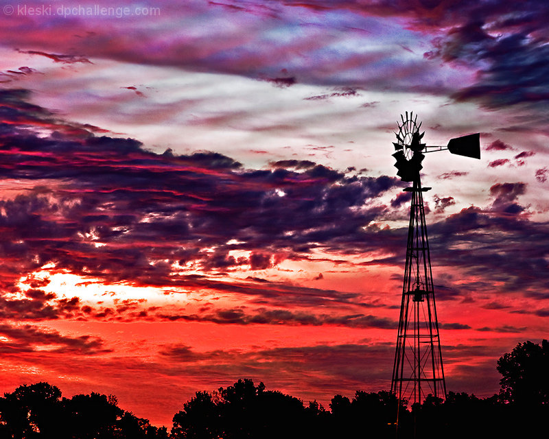
I didn't even realize there was a windmill in the challenge entry - definitely would have preferred the lesser saturated colors - but even then, I don't feel like the photo would have had the impact you wanted. Silhouette shots are hard like that.
I have to agree that the colors are just too over the top. The weather vane is completely consumed by them, whereas in the original there was a nice, sharp subject that stood out against an interesting sky. I think this is one of those times that, though it was there for the taking, less is more.







 Add photograph to your favorites
 Add photographer to your favorites


 Photographer found comment helpful.


