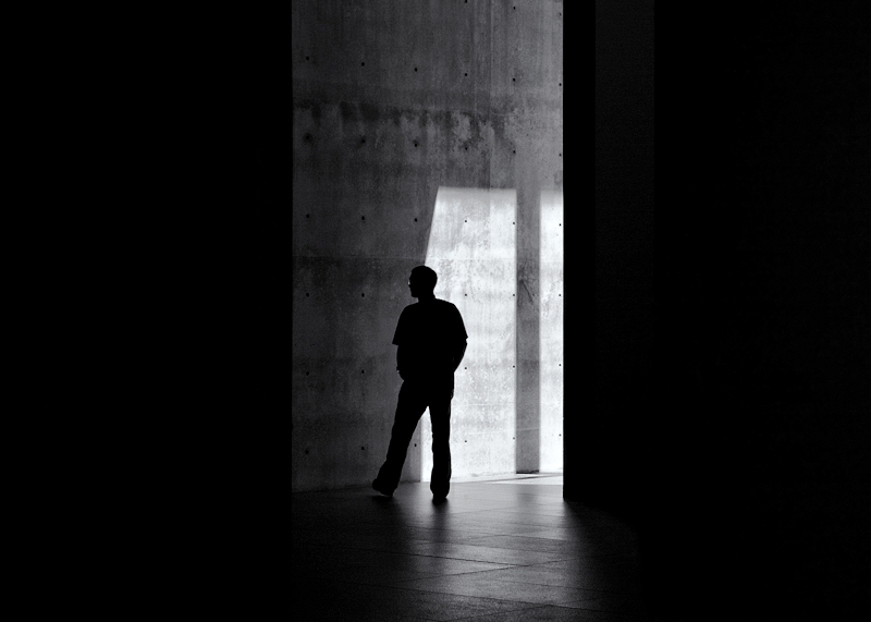
Photographed at the Modern Art Museum of Fort Worth during the recent Dallas-Ft. Worth GTG. I am pretty certain that silhouette is Adam, Cowboy221977. I didn't get too much into the modern art, but the play of light and shadows inside this building was fascinating. When I saw this scene through a doorway, I liked it, but knew it needed a little something more. That something more was a human element. I stood there and waited for some people to walk through. It was just chance that it was someone from our own group.
I waffled a bit between this and one that was a grainy, moody, cross-processed experiment that got some positive comments on Flickr (Including 4 from DPC members). I think this one has more potential for a freestudy, but is still a bit different. If it does a high 5, with stronger appeal for a smaller group, I'll be pleased.
Post-challenge notes:
Another highly successful mid-packer for me. Some great comments from exactly the folks I was hoping this would connect with. It's interesting that last months FS scored higher than this one, with a 6, but I consider it less successful due to a failure to connect strongly with anyone. Another example of why the average score is not the most important thing to evaluate one's entries by.
Statistics
Place: 131 out of 296 Avg (all users): 5.6953 Avg (commenters): 7.0833 Avg (participants): 5.7083 Avg (non-participants): 5.6563 Views since voting: 1351 Views during voting: 214 Votes: 128 Comments: 20 Favorites: 1 (view)
I'm going through the entries, stopping at those images I feel have had the benefit of an unconventional eye and dwelling a little longer to try to see and appreciate what you saw. This is one of those images.
Positives: Super shot with a great title! I really like the composition with the bilateral negative space. I like the way the light catches the glasses too. The stance of your subject and how it mirrors the lighting / shadow is a nice touch.
It's an intriguing photo, but I wish he would have been more towards the right than centered. This has a dynamic feel to it, but centering seems to make it more static. I'm not saying it well, but it just doesn't feel right here. -6-
This image is terrific but your title is FANTASTIC!!!! I keep thinking there is too much negative space on either side, then I think it's a triptych, then I think the visual area is too narrow, then I think this just perfect the way it is. He looks tentative, hesitating before deciding whether to enter the darkness or just walk away.






 Add photograph to your favorites
 Add photographer to your favorites


 Photographer found comment helpful.


