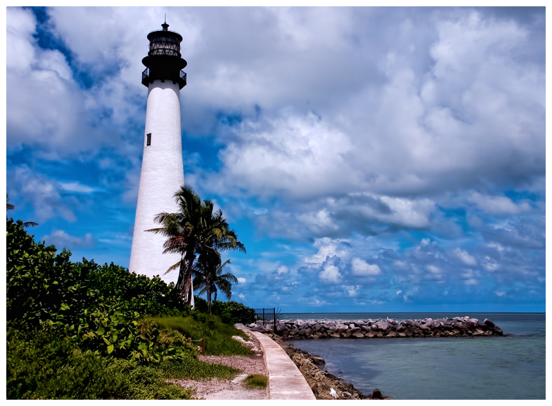
I like this, too. Very nice comp - could use a little more space at top, if you have it available, and maybe a little cut off the left.
Same issue as the wave photo - contrast too harsh, colors too saturated. Since it's advanced editing, you can do all manner of burning and dodging, or whatever other tools you have. The photo is totally worth redoing. Great FS theme.
|





 Add photograph to your favorites
 Add photographer to your favorites

 Photographer found comment helpful.
