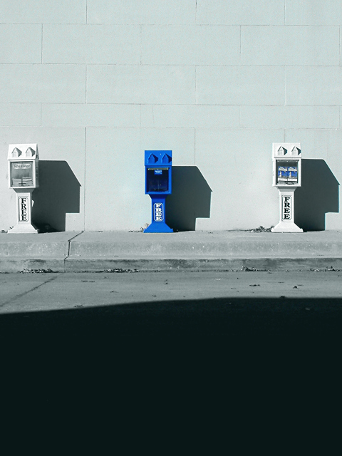
I am going to go against the grain here. I approve of the amount of shadow because it balances the space above the boxes and both work together to create scale and and a sence of isolation. All these factors add to the abstract ying/yang like character that made me laugh with pleasure when I first saw it. The only thing that would make it better is if the shadow had a straight line in keeping with all the other geometric shapes. That that was something that couldn't be controlled so that curve is just proof of reality.
Composition -- I feel that you have chosen an excellent subject for the challenge. The blue box stands out nicely in contrast with the white ones and white wall. In my opinion, I think the overall picture would be stronger if the boxes filled more of the frame. I am assuming you may have been constrained by accessibility, but if not, a couple of things may have helped. Getting closer to them, either physically or with zoom would have helped to eliminate the dark shadow in the foreground and the white space at the top. I enjoy negative space in photographs, but there is not enough of either to really scream ns to me. I am assuming also that there is something you did not want us to see on either side of the boxes. Otherwise, a landscape instead of portrait would work to give it a more balanced feeling. Something else to consider, would it have been possible to take it from a different angle? Maybe one where you are standing at the end of the row and taking a picture of them in the straight line?
Technique -- You have used the available light well. I like the way it makes the crisp shadows from the boxes. It makes it look very interesting. Unfortunately, the same light makes the foreground shadow large and imposing. I would suggest returning at a different time of day to reshoot, or cropping the shadow out. However, if you were trying to give the impression that teh boxes were being overtaken by the shadow, that works, I suppose. the focus looks a touch off to me, which may be because the camera was focusing on the pavement just in front of the boxes, or it could be this monitor at work.
Overall effect -- Overall, I felt that this was a fair picture. You have done well at capturing a subject that meets the challenge, and the picture is well done. However, I think it needs something else to make it a bit more interesting, at least for me.
Clean, unabstructed photo. My big complaint - I have the third rule because too many people take it as an absolute that can't be broken. In my opinion, it should have been broken here. Cut off over half of the bottom and over half of the top and you have a really nice photo. Right now I struggle to see the paper boxes and they are your subject. Crop at the end of the shadow on the bottom. That would bring them in nicely. Rules in photography are guidelines only. PTL 6
The large area of black ness at the bottom bothers me here, however with the size and cropping limitations, that's not your fault. Very nice blue shot. Good luck in the challenge.
This is cute. I'm not sure that I agree with your decision not to make this a landscape. I do like the layers created by the 3 vertical areas, but I think that you could show it just as well without so much empty space. It's also a tad off center with more space on the right. If you're going to make a symmetrical shot then you probably want to watch that.
At first I was really taken with this shot. As I scrolled down and saw the large amount of black (shadow maybe?) I was a little disappointed. Cropping off the dark and putting the paper stands in landscape mode would make this a "wow" shot, for sure!
The dark shadow in the street is a bit distracting but I like this set up and feel of this shot. If you could have placed the newstands further down in the picture and showed more wall it would have emphasized the blue a bit more - but I am not sure if that would have been possible here.






 Add photograph to your favorites
 Add photographer to your favorites

 Photographer found comment helpful.


