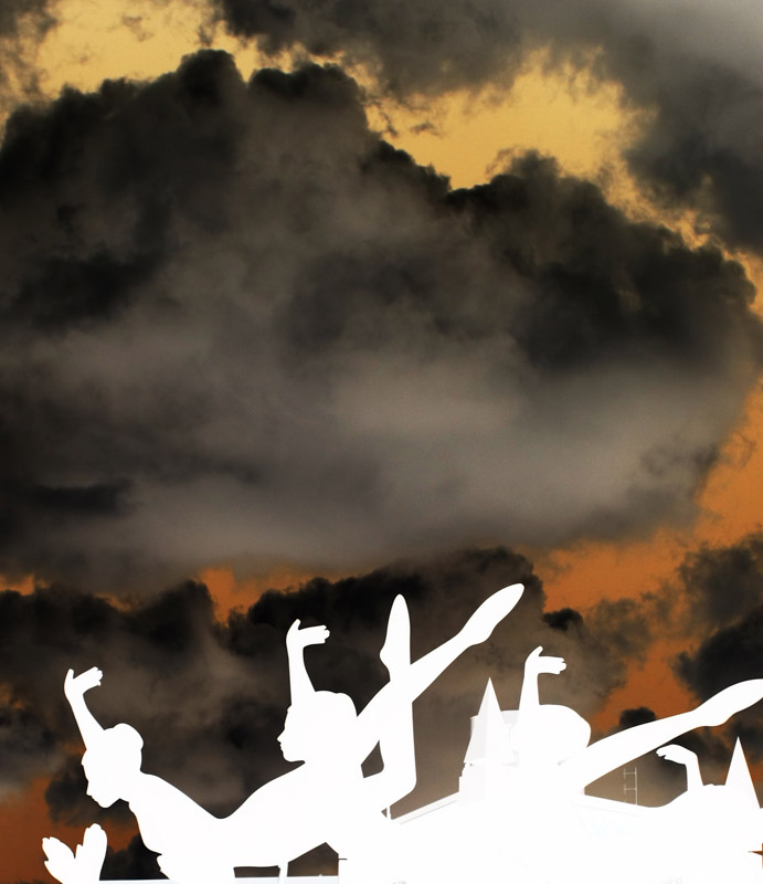
Back to comment: The building in the background really takes away from the shape of the statues. I'm sure you choose this perspective because of the building but there is way too much sky, which makes the composition look unbalanced.
Very interesting combination of realism and graphic. Clearly, the figures were completely silhouetted. The image is very powerful, but the contrast doesn't work that well for me. It's just a matter of taste, since it is clearly a fabulous picture.





 Add photograph to your favorites
 Add photographer to your favorites


 Photographer found comment helpful.


