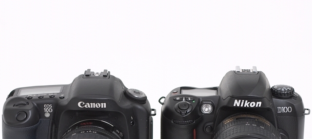
something feels off about this. maybe it's the uneven left/right crop, the harsh bottom crop or that they feel tilted. there seems to be a bit too much perspective as well. That said, I like the concept and the shot overall.
Very tenuous connection to the challenge. Without the title, this is a pretty meaningless shot. Yes it contains words but the product labels don't add much meaning or relevance to the veiwing experience.





 Add photograph to your favorites
 Add photographer to your favorites


 Photographer found comment helpful.


