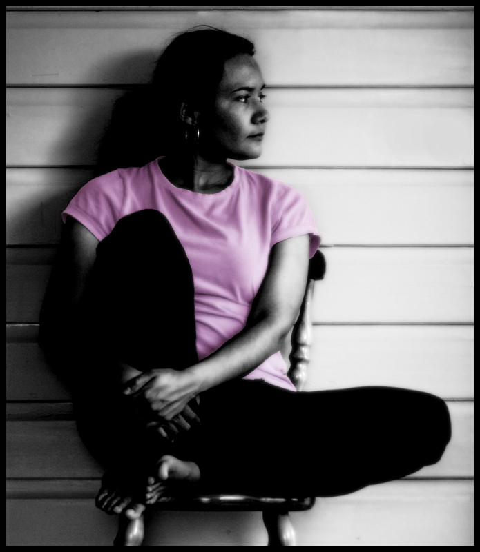
Editing: New layer from visable, desaturated image, increased contrast and erased to reveal colour of shirt. Image cropped. cloned out powerpoint. Added blur and brightened light areas. Added a border.
Statistics
Place: 44 out of 71 Avg (all users): 5.4071 Avg (commenters): 6.5714 Avg (participants): 5.1538 Avg (non-participants): 5.4533 Views since voting: 1078 Views during voting: 461 Votes: 253 Comments: 9 Favorites: 0
Hi Elle, you asked for a critique from the CC, so here I am!
Overall, I rather like this shot. In spite of being quite tight on the subject, it manages to give a really good 'feel' of place - even though this might be inaccurate. She (you?) gives the clear impression of gazing off into the wide open potential of the future, which is very appealing.
Technically: Your DOF and focus point is bang on, but it was an interesting choice of lens to use - the slightly longer focal length added to an APS sensor will tend to flatten out the subject, while your 18-70 towards the wider end would have given it more depth, which might be an interesting experiment - being that much closer would probably have required a smaller aperture though of course. I also like your lighting, although it is on the verge of looking blown out, which I suspect comes from the PP.
Artistically: The composition is excellent, no doubt about that. It is very balanced and uses an interesting but very relaxed pose. Everything else is completely subjective and down to personal taste. It looks like you are developing a style around the darker, high contrast black and white type shot. Personally I like it, and think you should always follow your own path, but there are plenty who will complain that you lose detail in the shadow and the highlights are blown out. They miss the point of course! The only part which I am not so keen on is the selective desat - this is a 'marmite' issue round here and I am not, in general, a fan. I don't think it adds anything here. The photo is very powerful without it.
In summary, the more I look at this shot, the more I like it. Such shots will normally suffer a little at DPC since they lack sunsets, but that is no reason to change! Incidentally, you may enjoy the work of Nixter and Hotpasta if this really is a style you are developing. Good Luck in the future!
Thanks for the nice comments everyone! ^_^ It's kind of scary putting on a self portrait, but I like the comment 'a woman of tranquil force'...I plan to refer to myself as that from now on!! Thanks :D
There's something magnetic in this photo, I really like it even if I'd prefer a B&W version (no pink shirt). The first thought when I saw this photo was : it's a woman of tranquil force. A great portrait imo !





 Add photograph to your favorites
 Add photographer to your favorites


 Photographer found comment helpful.


