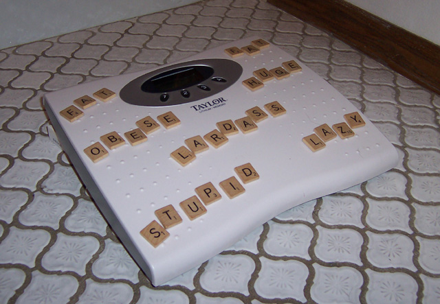
Something about the lighting just doesn’t feel right here. Maybe it’s the floor molding that is so dark and the bright reflection of the tub? I like the concept but I think the tile and the scale are enough to convey that this is a bathroom scene. I would have like to have seen this with like just plane white poster board background or something less distracting to give focus to the scale and words. Also little better fill with the lighting maybe
So being lazy is worth 13 points on weightwatchers? I like the idea. Infortunately the shot seems a little bit underexposed. If this can't be fixed in-camera, try it in a photo editing program using the Levels or Brigthness/Contrast feature.






 Add photograph to your favorites
 Add photographer to your favorites


 Photographer found comment helpful.


