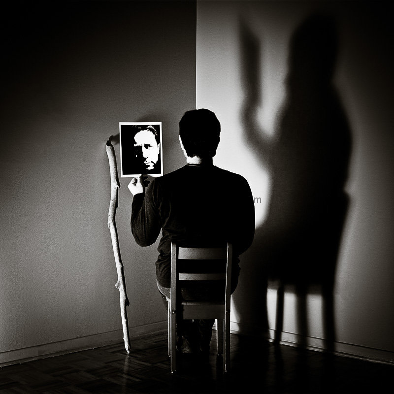
This is a masterpiece of composition and lighting. But it feels like two different photographs, both of which are strong. The vertical line that runs into his head splits the image clearly for me and I'd give a ten to the image on the right just because of the theme for this competition. The picture in your subject's hands and the stick leaning on the wall, I find distracting, only because of the theme. Less is more.
Interesting concept. Has lots of "mystery" to it. I like the possibility that the photo of the face is the person in the chair. Very interesting composition, I do like the lighting that creates the shadow which (to me) is as much of the composition as the person in the chair. Love the lighting and the effects of it.
The only thing I don't understand is the walking stick; is it part of the person? or an element to "balance" the composition? Whatever the case, I really like this pic.
Breathtaking. Surreal and wonderful. It looks like gyaban? Fabulous elements here. The walking stick is a terrific touch, and I just love the contrast of the soft-edged shadow with the sharpness of the person. My only grip is that it all seems way to crowded in the corner, especially the stick, which I think would have balanced the image better just a foot more to the left. (And a teensy nit about the scuff marks on the baseboard on the left - easily fixed in advanced). Front page.
Now THAT is fabulous. I can still see the face, which is what a portrait truly is about. The walking stick and use of shadow - SUPERB!! The most artfully presented image so far. 10 10 10





 Add photograph to your favorites
 Add photographer to your favorites

 Photographer found comment helpful.


