cclub
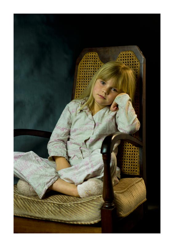
the picture has a serene feeling to it with a wonderful subject. However i feel it lacks a certain sharpness. The colors have a brown/yellow tint to them which clashes with the freshness of the subject. Also the chair has a really old feeling to it, which doesn't match too well with the subject. As has been mentioned, the white border is catching a lot (too much) of attention. While the subject is on a line within the rule of thirds, the cutoff of the knee distracts. A little more zoomed out could have worked better as it places her in a surrounding. A different chair (fitting with the subject), more upbeat lighting and sharpness would have made a top10 with such a nice subject imo. |






 Add photograph to your favorites
 Add photographer to your favorites

 Photographer found comment helpful.


