I wanted to do well in this challenge, so I put a little more than my usual 5 minutes into it. Actually - around an hour and a half.
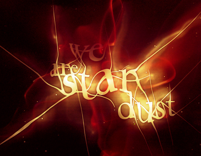
Reflecting on existence and all its seemingly improbable complexities (as I frequently do) drew me to create a statement that encouraged people to contemplate and ponder how they came into being. Of course, it always ends in tears for me when I try to work out what was before the 'Big Bang' - but that's my problem and, as scientists frustratingly put it - 'it's irrelevant'!!
---
I wanted colours that really create dimension on the screen - an almost tangible 3D experience by setting red next to yellow against black. When lookiing at the light points for a while the image begins to 'pop' out at you.
I also chose to create the sensation of energy, light and movement. This was actually a gamble due to the low-light shot and noise this generated - which rarely meets the demands of many voters for ultra smooth 'NeatImaged' shots.
With spot editing I could have improved massively the imperfections and linear striations that appear in the background, but I'm much more fulfilled since this is basic editing. Moreover, it's a shot that I like and had fun creating. :)
I designed the type, warped it in Photoshop, printed the statement onto tracing paper, laid it over glass and shot on macro while painting with my little Maglite on both sides.
Edits:
> Levels
> Colour balance
> Hue/Sat
> Add a touch of noise to reduce effects of linear striations
> Subtle PixelNhance clean-up
Statistics
Place: 13 out of 253 Avg (all users): 6.2810 Avg (commenters): 7.8889 Avg (participants): 6.1200 Avg (non-participants): 6.3923 Views since voting: 2450 Views during voting: 575 Votes: 306 Comments: 33 Favorites: 21 (view)
This is a masterful use of painting with light, and would like to commend you on truly fulfilling your goal! You certainly produced an image that truly capsulates everything you hoped for, so congratulations!
I think the major reason your score wasn't higher here was because this image comes off as a graphic instead of photo. Not that I'm saying it was heavily post-processed or anything of the sort, I simply think this type of photo doesn't fall in with most forms of photography.
Personally, I think the effect you created here is magnificent and shows an incredible control of light (a significant achievement considering photography is all about light). You managed to take a simple idea, and make is spectacular through your use of light.
Compositionally, I think the way you organized the words seems a little unnatural to me. I like the fact that you placed the word 'star' dead center in the image, it really gives focus to the image. My eyes do however somewhat 'revolt' when it comes to the other words. The second word is very hard to make out, and the word 'dust' is unproportional to the other two words above 'star', which instantly draws my eye towards it. I think also, if you had cropped a little more off the left side, it be more eye friendly.
Overall, this is a very good image, unfortunatly I don't believe it will ever be received well in the photography world, because it is something that graphic artists and the such produce all the time! Your lighting skills are remarkable, and you set out to produce something particular and you did just that.
Interesting effect, I wonder how it was done. You will have to let us in on your methodology. I think that this could be strengthened by adding more stars in the background, other than that, nice job!





 Add photograph to your favorites
 Add photographer to your favorites

 Photographer found comment helpful.


