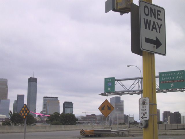
While the sign seems to be the focus of interest in this photo, it seems to have been chosen simply because it contains words. I don't find this an interesting or compelling scenic view and I don't find a surprise element in the words to make it a humorous or meaningfull shot. It just seems like a random snap shot to me.
This image is very hazy and feels last-minute. The composiion is counter to normal viewing, since we look up to down and left to right, but your subject is on the far right, and cut off at the top. I like the symphony of arrows pointing in different directions, just try to polish your execution.
from a composition standpoint, you want the viewer's eyes to move across your photograph. the one way sign and arrow takes them to the edge and right off the picture. try organizing your shots from different perspectives so you can find the one that grabs the eye and holds it.






 Add photograph to your favorites
 Add photographer to your favorites


 Photographer found comment helpful.


