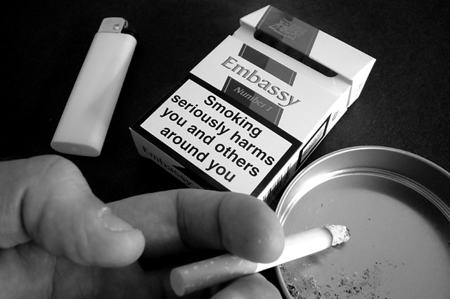
Would that some words were this obvious in reality. I like your composition, framing the bottom of the photo with the hand, cig and ash tray with the bix and warner beyond the smokers attention, but right in ours.
I feel like the composition is a little off here, not much though it good really, But I think if you would have cropped from the left at the lighter it would have improved, lighting and focus are good except the had is a little grey, but I think the hand is good with no focus on it, Good luck
I know that some people on the site have never seen that sort of warnings and some people might think you made it up. As someone who's subjected to these warnings everyday, I find it well suited for the challenge. I like the idea. But I think the objects in the image look too clean to make the full impact.






 Add photograph to your favorites
 Add photographer to your favorites


 Photographer found comment helpful.


