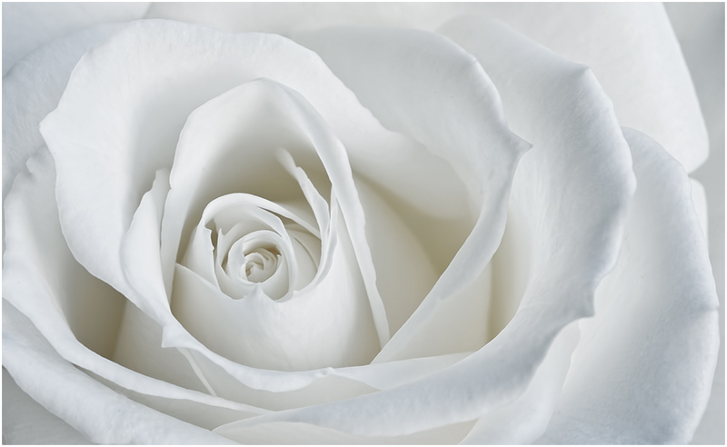
Hey Janine - this is very pretty. I am not sure it's quite high key enough. There's a grayish hue. The frame is okay, though you know how I feel about frames ;oD
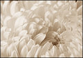
I played around to see if I could achieve what I thought this needed (in my opinion, of course):

In Selective Color, I decreased the black slider in White. In Neutral, I decreased cyan (and therefore increased red a tiny bit. The pink tint is of course not necessary, but it took care of the grayish hue.
The composition is great and the light is nice and even. Good photo - just the tones need tweaking. |






 Add photograph to your favorites
 Add photographer to your favorites


 Photographer found comment helpful.