Challenge:Blue (Classic Editing) Camera:Minolta DiMAGE 7i Location: London UK Date: Jan 12, 2002 Aperture: f/2.8 ISO: 200 Shutter: 1/15 sec Date Uploaded: Dec 1, 2002
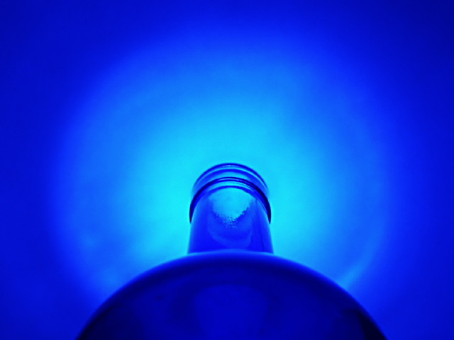
Shining a spotlight through the bottom of a blue bottle onto a white sheet of paper. This is so totally different from the picture I originally wanted to take, but there you go!
There's not much been done to it, run through NeatImage to clean up the noise and a fairly drastic crop plus a minor tweak to the levels to make the blue a little richer. It's a shame that the body of the bottle at the bottom of the picture is out of focus but I do love the rich blue tones!
Statistics
Place: 22 out of 243 Avg (all users): 6.2500 Avg (commenters): 7.5000 Avg (participants): 6.2667 Avg (non-participants): 6.2273 Views since voting: 1608 Votes: 260 Comments: 22 Favorites: 0
Initial thoughts This probably won’t be as unbias a commentary as I’d hope to make it what with us being married and all but I do like this one a lot and thought I might fit in an extra critique.
Composition/ Content I really like the landscape composition – infact I was probably responsible for you trying this crop since I wasn’t so keen on your portrait alternatives. I think it makes for a much better abstract and much stronger composition that the more obvious portrait composition. The portrait composition works to the obvious shape of the bottle – this works against it and is therefore quite exciting to me.
I like that there is some aspect of the rule of thirds, sort of – in terms of the positioning of the curve of the body of the bottle – and some aspect of centred composition in terms of the lighting and bottle top.
Background I think the background is at least as important as the subject here since it’s the soft circle of light which gives the composition some of its strength. The way the lighting is so well diffused by the bottle itself is very appealing.
Camera Work - Technical Some darkness on body of bottle though that does serve to anchor the image somehow. I like the DOF though would be interested to see a version sharp from front to back too.
Digital Processing - Technical Seems fine.
Fits The Challenge Oh yes.
Your Opinion On The Photo I really like this and NOT just coz you’re my husband!
Critique Club
Composition I think a portrait orientation would work better for this image it looks a bit cut short for want of a better description.
Background - Beautiful blue tones!
Camera work As you say the bottom of the bottle is out of focus, but it actually doesn't detract from the shot
Digital processing good you haven't been tempted to overdo the processing.
My Opinion I cant say much more about this shot except that I like it very much Congrats on coming up with an innovative idea that relly worked!
Good Shooting with your new camera
I think I would have liked to have seen this portrait rather than landscape with more of the bottle in the shot. Still a great shot though with a nice halo effect!
Could be a Skyy Blue vodka ad... nice job, I like it a lot! The different shadses of blue are "bluetiful" :-) I'm giving this an 8, cause I think the bottle could have been just a tad more in focus. Good job!







 Add photograph to your favorites
 Add photographer to your favorites

 Photographer found comment helpful.


