Author Thread Comments Made During the Challenge
Post actions
Focus needs to be a little sharper. If it weren't cropped so close it would be easier to read. Took me a minute to figure out what it says. This might make a nice poster.
Post actions
Cool concept - the picture might have been better if you had caught all the letters....
Post actions
Great idea. Paint would have made it more even coloured.
Post actions
A little confusing - harsh contrast, not particularly sharp.
Post actions
very cool .. not obvious at first glance .... 3 second voters may miss out ...
Post actions
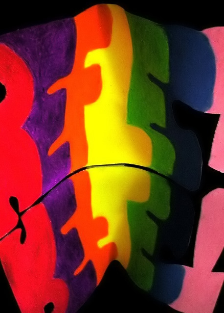
I like the colors and the abstract art to the photo.
Post actions
It'd be even better if you fit the whole word in.
Post actions
Good idea, but not quite legible. Not quite in focus either. I gave you an extra point for the thought you put into the idea.





 Add photograph to your favorites
 Add photographer to your favorites


 Photographer found comment helpful.


