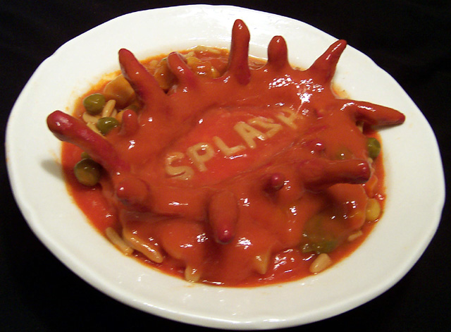
Like this shot, looking forward to finding out how it was done... Good idea for the shot, well executed, looks a little out of focus though and the white balance is just a tiny bit off. Good shot though! 8
A great idea and setup - except for the shapes that are supposed to look like they are splashing upward. They appear very awkward. Great use of the alphabet soup letters - I think you may be the only one to do so. Black background and almost square format were both good choices.
Is this plastisene? (sp). You've obviously gone to a great deal of effort to set this up, but it looks like at the last step you got some motion blur in the shot...






 Add photograph to your favorites
 Add photographer to your favorites


 Photographer found comment helpful.


