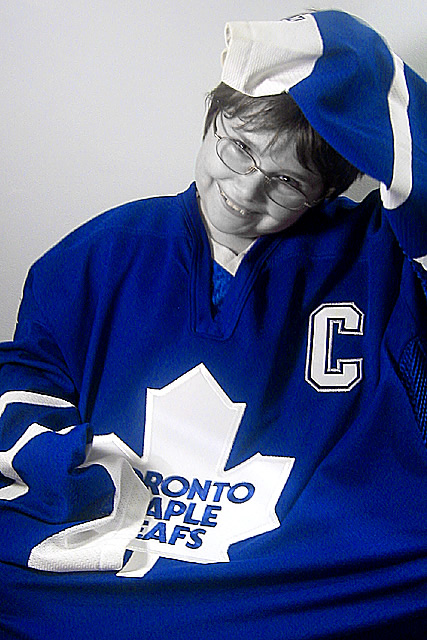
This is a great portrait photo. I really like the concept of the blue hockey jersey as well... I believe the desaturation on this particular image may be a little awkward possibly. The blue seems to be a little more dominant than I would like, IMO. The smile you captured here and the pose are both great :) I think this shot probably had just as much potential in full color :)
I don't think there is anything I would change at all on the composition or the technical aspects of the shot. This perspective looks great :) I wonder if a hockey stick propped up behind your subject would add a nice 'serendipity' to the image? Who knows...
I think the oversized jersey on the child is an excellent idea...
I thought the plural to leaf was leaves. He sure is a cute kid. I don't usually like B&W portraites but it is ok here. Good sharp, clear, well focused and cropped photo. The kid is a 10 and the photo is a 9. Way to go. Color would have been a 10. PTL
I don't like the effect of desaturating all the colors except one, and I think it is even less effective when doing it on the predominant color of the pic. I think its an effective tool when using it to draw attention to something that normally would be fairly unnoticeable otherwise. The picture looks overprocessed although it may be just slightly out of focus more than anything. - Inspzil
Nice use of the color blue (and only the color blue) Greying out the other colors is great. The blue might be a little too intense in the shot though, if the saturation on the blue channel was a little less I think it would have looked a bit better.







 Add photograph to your favorites
 Add photographer to your favorites

 Photographer found comment helpful.


