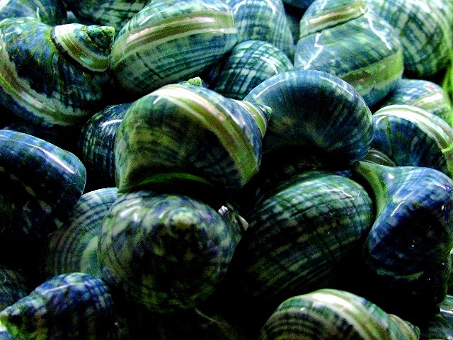
I really love the colors in this...I wonder what would happen if you ran a noise filter over this...I think it would make it nice and rich with the colors and smooth out the noise that is present...nice composition
Thanks for all the comments. The shells actually were blue. The green is more vivid than in real life. (Could be the flourescent lights in the shop.) As for lighting... I thought I'd try for a more dramatic contrast. Obviously, that didn't work. I'd say the vote came out right about where it belonged, if not a tad generous.
Ha... funny how this is the same title to my "texture" challenge submission! Just had to say so... ;0)
Not comparing the two.. just a comment on the title.
The colors look over saturated in this photo, and it also seems too dark. Rearrange the lighting to give depth and illumination between the shells.
I collect sea shells and not of mine of this kind are blue. I don't particularly like colorization. I think nature did a good job on its own. Just a personal thing. The photo is two busy, too many shells fighting for attention. Up close ones out of focus. Poor execution. PTL. 4









 Add photograph to your favorites
 Add photographer to your favorites

 Photographer found comment helpful.


