Thanks! I'm really, really happy to have placed so well in such a tough challenge. So many wonderful images.
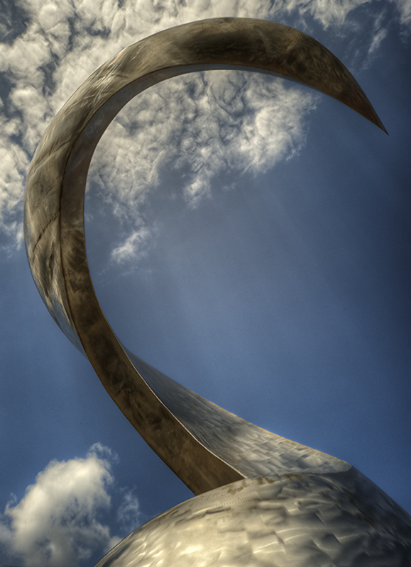
This is a sculpture in one of our squares in town, and my guess is that it's a take on a corkscrew, as this region (and the town itself) is famous for Riesling. It actually rotates slowly, and I'd have to wait 10 minutes or so between shots because the other angles were marred by buildings, trees, etc., in the background.
After a day of thinking about it:
Considering DPC's front page at the moment and even the top ten in this challenge, maybe I should have gone B&W.
Statistics
Place: 4 out of 82 Avg (all users): 6.7805 Avg (commenters): 7.5000 Avg (participants): 6.3889 Avg (non-participants): 6.9425 Views since voting: 3117 Views during voting: 267 Votes: 123 Comments: 9 Favorites: 5 (view)
I feel you would have lost a lot of impact by going b/w. You have such a great contrast with the blue and gold, and I think it wouldn't be as dramatic in grey scale. Great job!






 Add photograph to your favorites
 Add photographer to your favorites

 Photographer found comment helpful.


