|
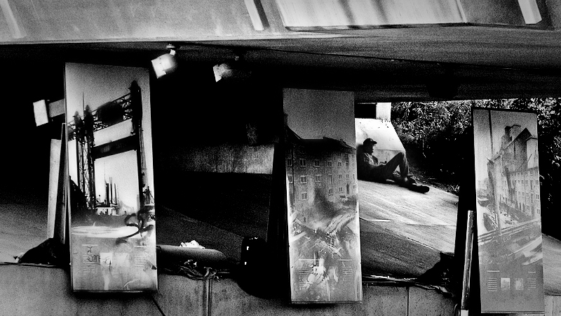
Fantastic image. For Nixter's style though, I think it has too much contrast, at least all over. Something I think he frequently does is bring up the detail in the shadows for parts of the image, then increase the contrast and chunk up the shadows in other parts of the image, to help anchor the most important parts in the deepest black. I feel there's too much chunked up black all over here, and the man just kind of gets lost in all of them. |





 Add photograph to your favorites
 Add photographer to your favorites


