In my opinion:
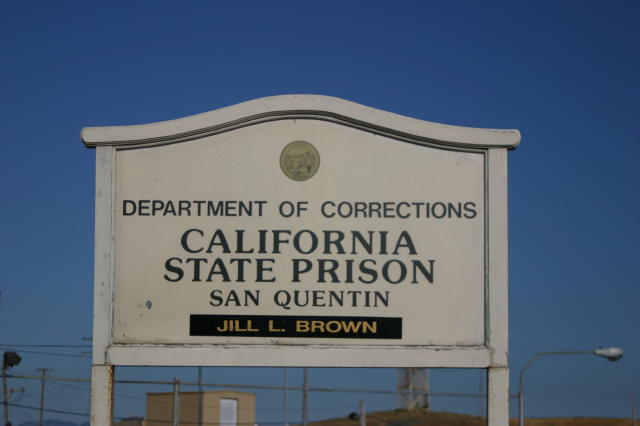
This photo is tilted few degrees clockwise,
It's too crowded below the sign,
the sign is not in the center, nor in the third's cross..
The idea is good, you can do better with this!
This looks a little under exposed / under saturated. Is that because you didn't want to stay long enough for a longer exposure? :-). When shooting predominantly white/light coloured surfaces you generally need to compenstage +.5 to 1 stop as the camera will read the 'average' light level to be quite high, and underexpose the shot. That might be what happened here?
This sign doesn't have much graphic appeal to be a compelling subject for a photograph. The street lgiht, fence, and outbuilding in the background just add clutter. Sorry, this is just very dull viewing for me.






 Add photograph to your favorites
 Add photographer to your favorites


 Photographer found comment helpful.

