"When you sit with a nice girl for two hours, it seems like two minutes. When you sit on a hot stove for two minutes, it seems like two hours -- that's relativity." -- Albert Einstein
---
What I was trying to convey:
The tick-tick-tick of the clock, confining our every experience to the rigid sameness of an outside definition of time. Free from the boundaries of time, the illusion of rigidness crumbles and falls, as all illusions must when gazed upon. We then find our lives measured, not by an outside regimen, but by our own perspective and interest in each experience.
---
How I tried to convey it:
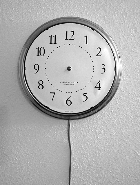
* the title to represent the dichotomy of time; a period is an arbitrary expanse of time and is also used to denote the abrupt and final conclusion of our thoughts.
* greyscale for the monotonous of time when rigidly controlled.
* textured wall for the abrasiveness of having every experience measured with the same rigidness.
* no hands on the clock for the freedom from the rigidness.
* the cord and negative space below to give a feeling of the rigidness falling away.
What I had to make due with:
I could not find a clock that matched the visualization I created of the scene, so I had to settle for this one. The one I wanted would have been larger, making the texture on the wall smaller and seem to cover more with their courseness, it would have also had a black matte plastic frame to not produce the glare and it would have been much newer to not have the bubbling of the face from absorbing moisture from the air over a long period of time.
---
For those who want to know:
* Shot on tripod with timer for maximum sharpness of the textured wall.
* Slight crop on the top and right to center the clock more accurately.
* Rotate 90 degrees clockwise.
* Levels to even out the tone a bit.
* Resize longest side to 640.
* Save for web.
* Submit.
Statistics
Place: 12 out of 140 Avg (all users): 6.0838 Avg (commenters): 7.0000 Avg (participants): 6.3375 Avg (non-participants): 5.9009 Views since voting: 2362 Views during voting: 319 Votes: 191 Comments: 32 Favorites: 8 (view)
Congratulations on your 12th place finish in a very competitive competition. There are several reasons why it finished so high, primarily because it defines the "ultimate" freedom - time. No matter what else could define freedom, time has to be number one. As I recall, you are the ONLY person who used this theme - which shows a good imagination along with creativity.
I'm doing this critique wothout looking at your 29 comments - just to see how it goes. I suspect most of what I'll say has already been covered. This is why I made the post in the forum - that once a CC member sees this - just drop a note saying the prior comments already "said everything I would."
Now - about the image:
Composition The composition is very effective - there's not much I'd chnage about it, although I'd like to experiment with the cord angling towd the left bottom, just to see what it would do for it.
Exposure Spot on, the white in the clock face is just white enough to stand out against the off-white wall.
Lighting Besides the great idea and composition, your photo is all about texture. The wall texture is absolutely perfect for the clock. (I disagree with your thoughts on that.) So - given that, what would be the best way to optimize the texture? I would love to see you shoot this with almost 90 degree side lighting coming from the right and producing long shadows on the left (main light.) I think long shadows would emphasize passing of time.
Then a small, well diffused light on the front - but not "straight on." The goal of this light is to light the face without producing the glare on the frame. It would probably work best to use a white reflector rather than direct flash.
Title I think your title is great, but not for DPC purposes. The voters here are very particular - so it just may have gotten a few more points with a title like "Who Cares?" (But if points aren't that important, as I said, I really like the one you used.)
Hope this gives you an idea of how I personally do a CC Critique.
Keep shooting and sharing - and congratulations again.
Very clever idea! My hat off for you, well if I ever had one on.
I've liked to see more plain background and the wire gone and bit less light from the right.
If I would have given you an 8.
Thank you for your exceptionally positive comments.
I knew I liked this shot, but it is really nice to see that I was able to communicate the concept as well as I did. It was not perfectly executed, as several of you pointed out, so I know where I need to work on the execution of the communication.
A special thank you to those who have chosen this as a favorite. You are my first.
I was hoping to make the top 25%, but 12th is more than I had hoped for.
I think this is probably my favorite photo in this challenge. Freedom is a concept that is destroyed by time. Your photo probably illustrates the purest form of freedom I have seen this week. When time is NOT of the essence, freedom is strong. Great shot and excellent thinking... = 10
Clever, original interpretation. I wish the specular reflection on the right wasn't quite so bright or large, as it pulls the eye away from the "subject" in the center a bit.
This competition's most creatively expressive illustration of the theme. A couple of the other entries affect me more strongly, but overall this is near the top for me.
Technical 2.5 - good tonal range, could be a little sharper, a little less grainy
Creative 2.5 - basic but strong composition
Conveys the Theme 3/3 - beautifully
Je Ne Sais Quoi 0/1
I love the way you made thewhite walls silvery-gray. Teo things distract from an overall fantastic picture. the clock face paper bubling up, and the glare on the right.
Absolutely a great idea to show freedom from the constraints of time. IMO the photo could be enhanced maybe by different lighting or a different perspective.
This is amazing, what a great ideea you had here. I mean in the today's world not many things can tie us up more than time. Fantastic! 10 + favorites, and I really hope for a blue ribbon on this. Good luck!
I love this idea and it conveys the challenge theme to me perfectly. It could be improved by placing the clock on a coloured background or even on a non textured background and by use of softer, more even lighting. 8
Nice capture of texture and detail. This is the kind of picture that can keep you looking to figure out what it means. How does a clock without hands relate to freedom? It seems to offer boundless possibilities.






 Add photograph to your favorites
 Add photographer to your favorites

 Photographer found comment helpful.


