Critique Club Critique
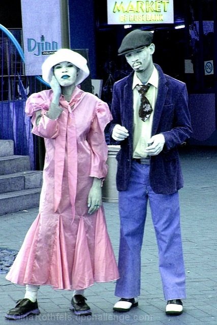
(1) COMPOSITION (CONTENT) - Good composition, straight on. I like the idea of using some unusual dress for the subjects. If they were “working” with you, I also would have taken a lot more shots in different positions, trying to get a composition that was a little more unusual – more fitting for the subjects. Perhaps off center some. I don’t like the sign over his head. I like their coloring.
(2) BACKGROUND – generally good. I like the blue tint. I don’t like the sign over his head that is so bright, and possibly overexposed.
(3) CAMERA WORK ,TECHNICAL – Good. However, too many elements look over exposed, eg, her hat, his hands. Though f/4.4 should be ok. The focus around his face looks slightly off – perhaps he moved just a hair.
(4) DIGITAL PROCESSING ,TECHNICAL – I assume the over exposure pieces are camera work, not post processing. If you use photoshop, adjusting levels & curves might have helped.
(5) MY OPINION ON THE PHOTO –A creative piece that could have done better, though I scored it above your average. I think the over bright areas could be toned down some, making this very good. In addition, moving them off center might help also.
I must be honest and say I do not like any colorization of a photo any more than I like modern art photography. Because this is my personal preference I will not hurt your score. I will give you a 5 which will not hurt you and in some situations will help. This is trying to be fair to you. PTL
Interesting and different. I like the fact she's in a pink dress and he's in blue. Very interesting photo, I think a lot more could have been done with this situation, this is a very straight on shot, but nice try!









 Add photograph to your favorites
 Add photographer to your favorites


