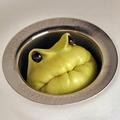
Sort of a "Losing Nemo." The fishbowl from my Orange challenge entry next to the window from my Color Studio Portrait entry. I had a lot of trouble controlling the reflections, and actually used car wax on the table to help the water bead up. I tried a plant in the bowl and different backgrounds, but liked the simplicity of this version.
I used a Shadow/Highlight adjustment, History Brush, and Dodging Burning to fine-tune the lighting. Cloned out some dust specks and random reflections. Applied USM and desaturated the blue and yellow. Submitted with the Fingers Crossed filter...
Statistics
Place: 2 out of 140 Avg (all users): 6.9834 Avg (commenters): 8.4138 Avg (participants): 7.0789 Avg (non-participants): 6.9143 Views since voting: 12293 Views during voting: 359 Votes: 181 Comments: 70 Favorites: 46 (view)
still one of my all-time faves. wish we had some way of ranking them, rather than just being able to add them...this would be very near the top of my list.
this was my 2nd fave, and i love it as much today as the first time i saw it. the first thing that struck me was "how clever!" the concept of 'freedom' was instantly communicated.
granted, in the past year, i've come to know and love not just shannon's work, but his work ethic. he is a great example of setting your sights on a goal, and relentlessly pursuing that goal, until you achieve it. as a result, not only has his photography and ability to translate his vision into photographic images strengthened, but he has been recognized as one of dpc's valued assets. not bad for someone who professes not to even know what the ROTs were prior to dpc...
there are two other things about this image that really hit home: one is its visual simplicity, the other is just how much work it took to make it happen. granted, shannon's professional experience has taught him 'attention to detail' (well, i'm sure that getting smacked in a few challenges helped a little, also), but when you compare the difference between what he has rendered with a simple household object to what many people do with the toys around their homes, you can learn a lot about the art of presentation.
i'm not suggesting that everyone has to spend hours and hours trying to perfectly polish a table or building a set or painting a driveway, but, all the same, if you want what shannon's got, he's given you a pretty solid roadmap.
thanks, shannon, and congrats on your being named to the SC!
Terrific shot Shannon! I didn't get a chance to vote in this challenge, but if I did, this likely would have been my highest rated image. Love the concept, and your execution is great. The DOF is spot-on; I really like how the wood grain of the table blurs smoothly away... I know how hard it is to control reflections in a roundish object like your fishbowl, and you did an admirable job. Congrats on your first ribbon!
Very nice color balance, When I looked at this, all I could think of is FREEDOM has it price! Its worth dying for! I hope the fish found open water! I gave it a 10!
lol...great composition..hope this shot does well...my wife would kill me if I left water on the table like this (it kinda makes me nervous) :)
Good luck
The lighting and colors make the picture look very classy and sophisticated. It almost makes me want to get myself a nice tall glass of whiskey on the rocks despite the fact that I don't drink. Unfortunately the mood of the story that the picture tells is a more light and humorous one, which creates some overall incongruity. Aside from that, it's still an excellently taken picture and I'm rooting for it to do very well in this challenge.
Wow. I predict that this will ribbon. The lighting and focus are excellent. I really really like the wood grain and the color of the marbles. I think many people would have gone for a more dramatic setup on a plain white table that I don't think would have had the same effect. The idea, of course, is outstanding! 10





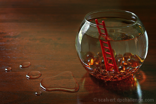
 A Daring Escape
 Add photograph to your favorites
 Add photographer to your favorites

 Photographer found comment helpful.


