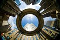
This is one of my favourites in the challenge. I love the way the rotation of the buildings implies a flowing wall of windows. My only gripe would be the area far left is very dark, but nonetheless still a top 10, maybe top 5 in my eyes.
oh, what a cool idea! I like your POV on this one. Though I'm curious what it would have looked like if you had cropped up a little from the bottom and in a bit from the right. The bottom building looks a little heavy for such a flowing image. Perhaps it's just because it's so dark on the left? Maybe just lightening the shadows through shadows/highlights would work instead of cropping...?
Hmmmm. I like the b/w conversion, and there is great detail in this image. Not sure about the rotation. It seems just a bit off level horizontally, or not tilted enough to be tilted.







 Add photograph to your favorites
 Add photographer to your favorites

 Photographer found comment helpful.