oh yeah, it wasnt really a macro. i was just trying to imply that we were looking at the building blocks of the universe through a powerful magnifying lens
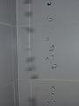
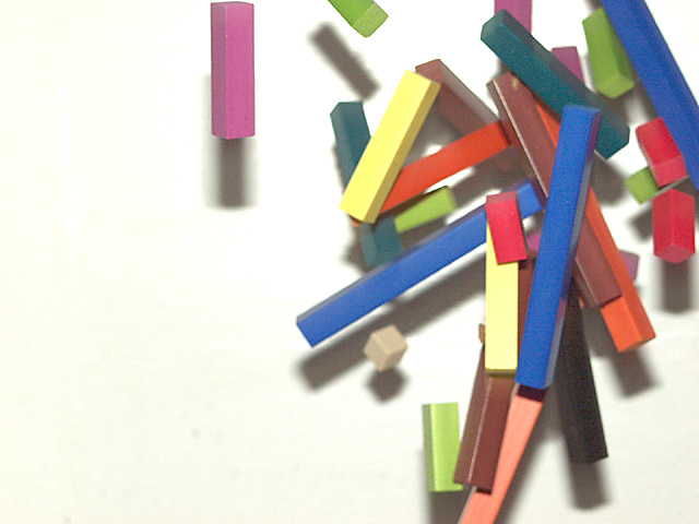
This stopped motion, and would be of the clearest state if the focus could have been more defined. A good job of leaving all other elements out of the picture.
Good idea. Don't think macro was the way to go with this one, as it gives you blur when the challenge called for no trails. Leaving the left side of the photo also takes away from your subject.
The colors are good (slight yellow cast), and I like the composition. Would be much better without the shadows on the bg, though. Moving away from the wall and/or using a light off to one side rather than an on-camera flash would help.
The originality here is great, and so are the colors -- though I think the off-white might be the wrong color to bring out the vibrance of these blocks. Maybe cover it with white paper? My favorite part of this picture is the memory it brings back -- i remember these blocks!!! Ahh... childhood.
Nice idea. This would have been much better with a softer color for the background and less shadow. Overall the effect is great. It is sort of an abstract photo.
I totally dig the way this looks like cubist art. First, a suggestion: I wish that it didn't feel like such a soft focus, even on the pieces that are in the focal plane. Second, a purely subjective preference: I would like this even more as something I'd be interested in hanging if the pieces were made up of less earthy colors and more basic primaries, although I recognize you have to work with what you have. (Hope that makes sense.)
Focus almost seems a little fuzzy. Looks like your lighting was from a different angle than direct from the camera --based on the shadows. I like that. Did you drop the blocks from top to bottom in fromt of a wall? Or are we looking down at a table? Just curious... doesn't affect the photo quality.
At first, I didn't like the empty space on the left. At my second look, though, I think it gives it motion. Eliminating the dark blocks and using only the bright ones would've added a neat effect, too.
This is a nice stopped motion shot. I'm not in agreement with the framing... I would rather see the blocks in the center of this image and would have rather seen the image vertical instead of horizonta.





 Add photograph to your favorites
 Add photographer to your favorites


