thrown together
all of us
shamelessly
shimmy
in this once and only light
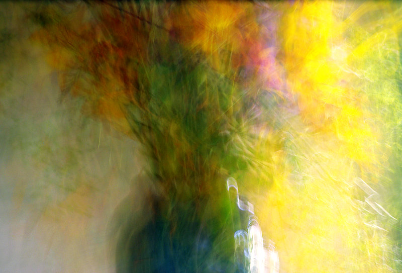
(Processing: had to crop a little tiny bit, and bump up the saturation in my typically crude manner. And some sharpening before resizing. The wiggle is my personal beat).
Saturday. Most gratifying comments. I think I felt a bit like Paul about this picture; I chose it because it was just more fun than the others, but having chosen it I wondered if what I really wanted to do was paint - I would have done the vase differently. Perhaps. In fact, I am quite delighted with the way the colour has landed on this canvas.
[Aug. 7th, 2010 10:54:24 PM]
(Yes, a vase of flowers from the garden. All natural light from various windows, and from different angles. It happens like this only for a week or two in summer).
Statistics
Place: 133 out of 362 Avg (all users): 5.7926 Avg (commenters): 7.3810 Avg (participants): 5.7170 Avg (non-participants): 6.0690 Views since voting: 1198 Views during voting: 250 Votes: 135 Comments: 36 Favorites: 5 (view)
Truly beautiful. Some sort of sea change must have happened around here for this to end up close to 5.8, and in a Free Study to boot! I really expected to see this at the bottom of the pile. The voters have summer madness perhaps? Let's hope it's not a fly-by-night fancy and DPC really has changed...in any case, congrats on having this lovely, striking image be so well-received!
By the way, the other word that comes to mind as I look at this is "Encore!". Maybe like Monet, you can do multiple studies of this vase, this location, at different times of the day/week/month. Show us the light.
Wow -- 3 favs! I love the colors and chaos. It feels like the orientation is wrong. If I were to hang this, I would rotate it 90 degrees counter-clockwise.
Nice bouquet! Puts me in mind of early morning sunbeams & furniture polish. Lovely feeling of air in motion. I admire the painterlye ffect created by the motion. Hope you posted some notes. True, it's a centered comp, but still perfect in its own way. Please accept this Gilded Lily and my humble admiration for a very well done shot!
I'm going through the entries, stopping at those images I feel have had the benefit of an unconventional eye and dwelling a little longer to try to see and appreciate what you saw. This is one of those images.
Positives: bold abstract with really nice colours - always good to see people taking a chance in the Fre Study. I like that I can still see this is a vase of flowers.
Critical stuff: I like the image, but I think it is suboptimal, the colour are great but the junction between them jars a little. I think adding some diffusion in your workflow would have worked wonders to mellow the image a little.
Overall: Very nearly there, but falls just a little short of my sweet spot.
I would love to see this abstract win a ribbon. It's beautiful and I hope you've included the technique in the photographer's comments section. I can see this hanging on a wall and the only critique I have is I wish you had included a border to impart that usage. 10 from me.
Quite enjoy the impressionalism of this. My only suggestion would be to clone/fill in the whit part at the lower right side of the vase just a bit. The explosion of color is quite lovely, though!







 Add photograph to your favorites
 Add photographer to your favorites

 Photographer found comment helpful.