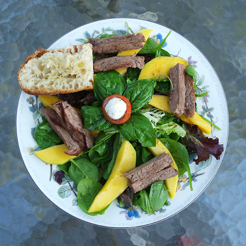
The light is perfect for the type of food you photographed, but I think the background doesn't fit. The food looks more like an upper-class restaurant dish, but the background doesn't match.
Pretty looking dish, but the lighting could be improved a little to make the colours a little brighter. The red under the table is slightly distracting as well.
I dont know if it my monitor or just the editing, but your colors seem a bit flat. My personal desire with food (especially with a summer theme) is for vibrancy in color and light. I gave this a 7 - but with a tweak in color and light to make it pop more it would have scored higher.





 Add photograph to your favorites
 Add photographer to your favorites


 Photographer found comment helpful.


