Author Thread Comments Made During the Challenge
Post actions
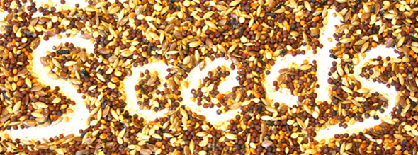
A very good idea, but I would have worked on it until I got more shatpness.
Post actions
I like your idea here, the image is sharp and appealing, my only complaint is that the white is too bright, it hurts my eyes, and makes it hard to read. Tone down the white a bit and this will be a nice image.
Post actions
Clever idea - original. May be slightly over exposed but I actually like the effect.
Post actions
A petty it's too bright. A nice concept though. It could be better if the light was a bit soft and didn't burn the coulors.
Post actions
Post actions
most original- nicely done!
Post actions
Post actions
Clever idea. I think the first S is cut too short on the left side. It runs off the photo which leads my eyes off the photo too. Good luck :)





 Add photograph to your favorites
 Add photographer to your favorites


 Photographer found comment helpful.


