Proof that you should always sleep on an image! I came back to this the next day after submission to find that I really dislike this image.
Tanguera is quite right - too different. I have since done a full black and white which is soooo much better. I had briefly tried it the night before - not sure why I rejected it.
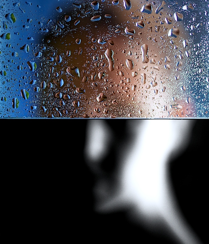
People are asking how this was done. The image has been rotated about 90 degrees clockwise, the glass is vertical. There is about 40cm of space between the glass and Nic who was on hands and knees sticking her head forward. The glass is sprayed and using the nifty 50mm macro I have the camera positioned close to the glass, focussed on the drops at it's widest aperture.
Bottom half has had the pinhole filter of Silver Efex Pro applied, top half Color Efex's Tonal Contrast ( removed from the skin). The editing was a bit more involved than that, but this was the gist. I submitted a full list of steps with the original to SC on upload. I though the black background on the bottom woul prompt a validation request.
Statistics
Place: 59 out of 231 Avg (all users): 5.8992 Avg (commenters): 6.9091 Avg (participants): 5.9773 Avg (non-participants): 5.7317 Views since voting: 1293 Views during voting: 290 Votes: 129 Comments: 17 Favorites: 0
Proof that you should always sleep on an image! I came back to this the next day after submission to find that I really dislike this image.
Tanguera is quite right - too different. I have since done a full black and white which is soooo much better. I had briefly tried it the night before - not sure why I rejected it.
I am glad you kept this one in the challenge, and I think its a great image. I gave it a 9, and if I could control the ribbons, you wouldve gotten one. Its brilliance is that it is different.
Just read your notes. My vote of 9 says that yourself and Tanguera are wrong. The out of place contrasts between the upper and lower half are what makes this so fascinating to look at.
hmmm very interesting, I will be looking forward to see if this stands up to the rules, but i love the non linear feel to it. my first 10 of the challenge
Very interesting and haunting image. I find the two different styles too divergent from each other to create any harmony or symbiosis. But it is unique.






 Add photograph to your favorites
 Add photographer to your favorites

 Photographer found comment helpful.


