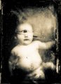
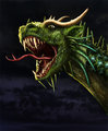
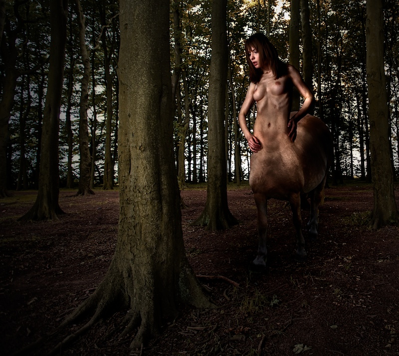
Could have just kept tweaking this. This is my first composite image in a challenge and only my second composite image (the first just being a background swap).
The lighting is still all wrong but given the vastly different shooting conditions for each of the three images, I couldn't get it better with my limited skills. However, I am sure I shouldn't have rushed my selections, a bit of feathering would have done wonders. But I did most of the post compositing work in Aperture with Color Efex Pro plugins, so no opportunity to refine the selections after all the filter work.
I'm sure it won't be able to live with the competition in this challenge. Just as well because with all the tinkering, my editing steps might be a little tricky to recount with perfect accuracy.
I'm pleased I got something in though.
Post challenge:
Ten 1s - that seems a bit disproportionate. Nude prudes flexing their voting muscles or did those voters really think this was one of the most poorly executed images in the challenge?
Statistics
Place: 12 out of 83 Avg (all users): 6.3068 Avg (commenters): 7.2273 Avg (participants): 6.5319 Avg (non-participants): 6.2581 Views since voting: 9269 Views during voting: 736 Votes: 264 Comments: 33 Favorites: 3 (view)
Didn't vote in this challenge but just saw this now. The 10 1s is a joke right? Must be the nude prudes. Seriously good job in my opinion. And 12th was pretty good going too!
Ten 1s. I just can't believe it. I suppose these voters also close their eyes when they change their clothes, to not be offended by what they could see. Pathetic.
This is one of the best entries of the challenge in my opinion, congratulations.
Great editing here; the merge of the horse and the torso is very nicely done. I'm wondering what she's looking at (it appears to be behind the tree) and why her left hand appears larger than her right. (8)
Very nicely taken and great job blending your model's body with the animal. I think its a great image but just a touch too dark around the bottom half of the centaura.
ETA: I just viewed this on my laptop and noticed its not nearly as dark as it was on my mac, pretty sure its the gamma difference. Bumped to a 7.
The blending of the female body to the horses body is spot on flawless. Even the stance of the two components work well together. I also like the attention to detail in this image in that the shadows fall correctly on all elements to make the scene believable (i.e. look at where the shadows fall on the tree trunks, the horse's body, and the woman's torso). The shadow underfoot of the centura helps the blend her into the scene; she appears there and not pasted in. Nicely done.
Nice tree? I think the blending is good, but it appears that there is too much space in between the waist and legs of the animal. Otherwise it looks great. I'm wondering what has her attention though?
Overall, this image is very captivating. The lighting and the colors all work very well and create the illusion of the creature actually being in that place. But I have some issues with the composition. The main tree looks like it is blocking the scene rather than being a part of it. And the creature is also a bit odd. I think the fact that we can still make out her legs is a bit creepy, as it puts her, um, special area right in the center of the creature's chest. I think merging her at or just above the bellybutton would have eliminated this issue for me. But hey, it's your creature :-)





 Add photograph to your favorites
 Add photographer to your favorites

 Photographer found comment helpful.


