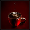
Same methodology, just another cup and some other colors. Evolution of the collision of 2 milk droplets in coffee, shot using the flash in stroboscopic mode. I didn't have much time on my hands, so this was achieved after about (only) 100 tries. This shape is less symmetric than on my previous photo, but I hope it will perform decently anyway.
[Jul. 21st, 2010 04:18:49 AM]
21/07: I have to agree with the comments, the original is better. As I said, I didn't do many tries, due to lack of time, so I didn't "fine tune" my setup as I did the last time. However, I'm pleased with one thing: the focus is better this time on the droplets, I certainly improved my skills on that. With a little luck, we'll have a "droplet" challenge soon, so that I can do that again! (I can hear the "noooooooooooes!" ;-))
Statistics
Place: 8 out of 76 Avg (all users): 6.5966 Avg (commenters): 7.6667 Avg (participants): 6.5263 Avg (non-participants): 6.6296 Views since voting: 3055 Views during voting: 278 Votes: 119 Comments: 14 Favorites: 1 (view)
This is a tough one to recreate, I believe. Congrats on the top 10 finish. Having already seen your first entry, I feel that one still has a relatively better visual appeal than this. But this is a great shot too!
A pretty good shot but I don't think it has the elegance of the original - I think it is a colour thing. However, very well executed and actually a slightly sharper crown.
Not a big fan of the "water drop" type of shot...It's been over done on this site...However, You have created a real good image here. Ther is alot of detail and I like that...I give you a 6...Good work.
how much coffee and milk did you go through for this one??? what I really like about this are the colors...all of them...they make me want to reach for the cup of coffee...great job
wow you chose a tough one to redo - a ribbon winner! maybe this is gyaban himself since the type of lighting is similar. what i like about this one compared to the original is that the focus seems to be more on the drops instead of the cup (as is in the original). i like how the color of light is a great contrast to the color of the cup.
Nice attempt of a very difficult shot. The richness of the original is not here, and the splash center seems double exposed and not as clean. But the extra little droplets all around are great.
Great job! I tried this but failed. It is nearly impossible to achieve such a photo without equipments like Cognisys StopShot module, and I believe that it is still not easy even with the StopShot module, so you really did a good job.
Comparing this photo with the original, the umbrella shape in original looks better. Besides, since it is an advanced editing challenge, you could remove the tiny dust on the cup. Finally, the light on the rim of the cup is hard for my taste and I prefer the softer tone in original. In conclusion, I give the original 9 and give yours 7.




 Add photograph to your favorites
 Add photographer to your favorites


 Photographer found comment helpful.


