COMPOSITION:
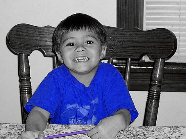
I think composition is probably the weakest point in this photo...and I'm going to picky. 1. The window in the background is very distracting. 2. the framing of the photo seems a bit tilted to the right...try rotating the image CCW a bit. 3. The straw he's holding has to go. 4. He's too cute to have such an elaborate, bulky chair 'growing' out of his head which distracts. 5. Place the boy more to the left of the frame (rule of thirds), or IMO close in on him and make him fill the frame more. :(
..sorry if I'm being too picky, it only get better from here on, though :)
TECHNICAL:
Great! The lighting is soft and even on his face. Focus is good. I would try lighting him with something other than the on-board flash. :)
ARTISTIC:
Funny, cause I did a shot similar to yours and used the same technique...and a cute kid :) I think you did a great job in desaturating the colors, and leaving the blue shirt. It seems like everyone is now doing that same thing to their photos. I still like the effect though. :)
OVERALL:
This could make for a cute portrait of this boy...I like the expression on his face. You'll need to be a bit more conscious of his 'surroundings'...IMO.
Nice blue shirt. Well manipulated (purple straw). I initially didn't like this very much, (scored a 6), but I've realized I was bias-ing, since this effect is used in nearly every challenge, but that's judging against other's photos, not THIS photo. Score upgrade to 8. Swash
Lighter blue in the shot would have been nice, that blue is just a little too intense. And a different color straw next time so it too fades away... ;)






 Add photograph to your favorites
 Add photographer to your favorites


