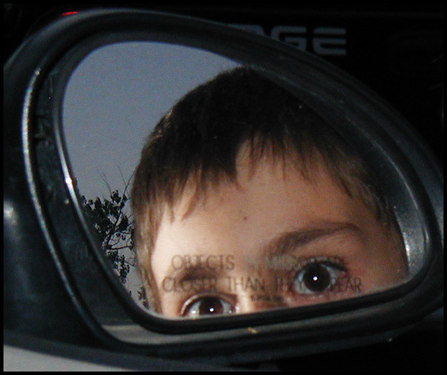
Good idea. The lighting doesn't help, though. Your lettering is hard to see in that angle, and the photo is pretty dark overall. Perhaps a lighter image reflected behind the letters would have let them show through more. Also, the partial brand name and the door frame are somewhat distracting.
Not very original. The focus is a little soft. The extreme pinpoint highlights in his eyes have a creepy effect. This isn't a great use of the surrounding areas of the frame.
the flash reflection on the plastic part of the mirror distracts. that could be handled by cropping. also, try experiment with diffent settings for DOF.






 Add photograph to your favorites
 Add photographer to your favorites


 Photographer found comment helpful.


