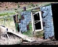
I like the way you have used the tilt and the low perspective to add additional interest to the scene. Personallly, I find foliage backgrounds to be a bit messy - because of the high inherent contrast in the highlights and shadows of the leaves. sometimes I'll edit in a way that diffuses foliage like this image:
The box itself is certainly grungy but whether it comes over as weathered will be a matter of debate. Putting that to one side, I 'lll consider whether the image is technically good and whether it is beautiful / interesting. Technically this is OK, but on an interest level there isn't much here (beyond the POV) that communicates your choices as a photographer; for example, the DOF has a point and shoot feel about it - like you haven't taken control of the aperture - as if you avoided the choice. I could say the same about the exposure - it is a little vanilla and there would be more drama in over or under exposure than there is here.
Perhaps you could have gone monochrome, raised the black point to deepen the shadows and added a vignette. These are just possible choices but I think they would maximised the interest in the image and help to keep your main subject from competing with the background.
Interesting subject but I am not sure this totally screams weathered to me. Risky choice of composition as the tilt seems to be just for the sake of having tilt. I don't think that typically works well on DPC. The tilt really needs a purpose.
Very harsh and challenging lighting conditions make for challenging technicals. You have a lot of shadows together with the harsh sunlight, but I think you have handled that aspect reasonably well.
Main challenge with this one for me is the subject and the tilt.






 Add photograph to your favorites
 Add photographer to your favorites

 Photographer found comment helpful.


