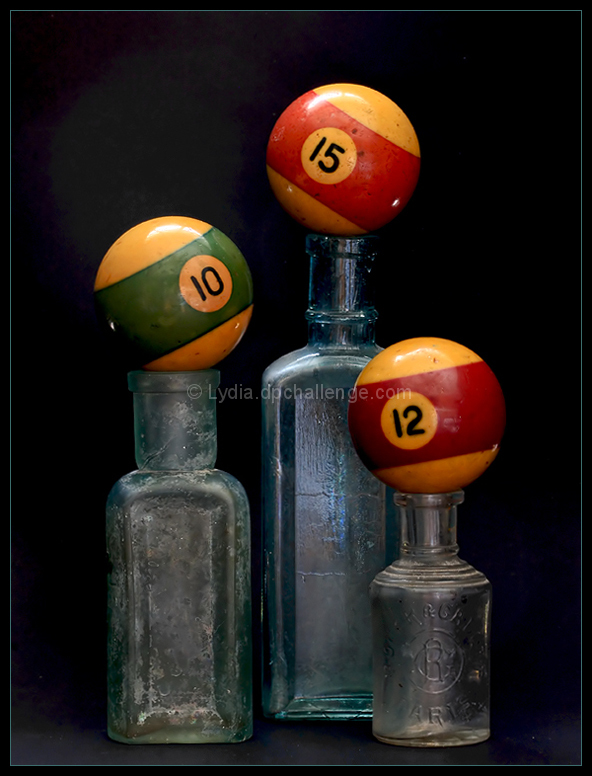
I really like the presentation here. It's nice and simple and has interesting texture. I like the look of the aged/worn pool balls. One of my faves in this challenge.
I like the composition and layout here. If there is one nit pic it is the light on the crown of the balls which tends to catch my eye. A good take all the same.
Love the tones, colours, age, and feel.
One thing I can't quite make out (and I think I'll be giving you the benefit of my doubt) is whether the glar-like looking thing on the top right is from flash/lighting. I don't think it is cause it's there at the bottom too. If it isn't due to the lighting I think it'd look better with a consistent one. I like that none of the balls are nice and flat.






 Add photograph to your favorites
 Add photographer to your favorites

 Photographer found comment helpful.


