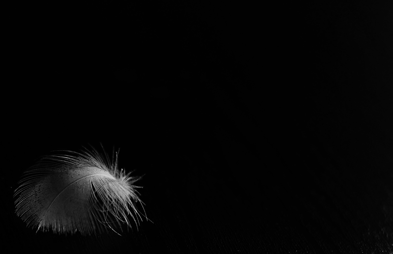
Prash, this is a really nice image. The negative space works well. The lighting is a bit flat and is not really giving enough detail in the feather. It just does not stand out very well. Trouble is, I think if you tried (in basic editing) to bring out the highlights better, you would end up blowing out the better lit part of the feather.
I think in terms of this specific challenge it is just a little bit too outside the box and could easily be interpreted as DNMC. I personally do not think so, but can see that others more rigid in their definition may. Got a 6 from me and that would have been higher if the lighting on the feather was a little better. Loved the negative space, although I wonder how it would have worked if the feather was on the right of the frame instead of the left?
As we in the Western world read left to right, you often find that placing the main subject closer to the right of the frame works better than placing it on the left. At least that is what I have been told by someone more experienced than myself! It's probably a subconscious thing and something I'd like to test one day.
I would be disappointed with a 5.0 score for this to be honest. I think it deserves a mid 5 score at least. Sorry it didn't do better. If you want to post the original in our pm thread, do it and we can re-edit it.





 Add photograph to your favorites
 Add photographer to your favorites


 Photographer found comment helpful.


