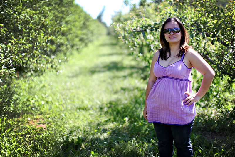
This image has potential to look pretty cool, but I think you need to work with the light here a little more. If the model had turned to her right a little more, the sunlight wouldn't have fallen on her forehead and chest; it would have just created a hair light and rim light. You could have bounced a little more light on her front so the rim light wouldn't be so blown out (but a bounce card would have shown up in her glasses--you'd have to deiced if you are ok with that or if she should remove the glasses). If you had also shot from a little higher, you could have cropped out the sky, which is one of the brightest spots in the image, so it pulls too much attention.
I know this comment is really long, but that doesn't mean you image is bad. I thing you did a lot of things right too. I like that the pinkish-purple of her shirt contrasts well with the green background. The depth of field is spot-on too; just deep enough for her to be completely in focus, but shallow enough to blur the background out too. |






 Add photograph to your favorites
 Add photographer to your favorites


