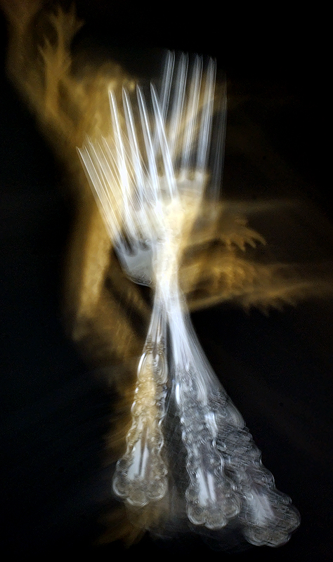
This doesn't really feel very "frenzied" to me. It just looks like you moved a fork around. Motion blur has a lot of potential for a topic like "chaos," but you have to have the right subject.
I'm guessing this is an entry from Pixelpig. Definitely an improvement on the first version. The details of the fork, though still blurred, stand out better from the background. Has a good amount more visual pop to it.






 Add photograph to your favorites
 Add photographer to your favorites


 Photographer found comment helpful.


