Author Thread Comments Made During the Challenge
Post actions
Post actions
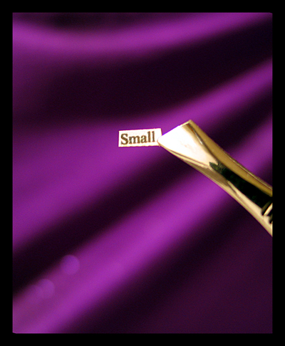
This looks either out of focus or over sharpened and there are 3 blotches at the bottom left that are distracting.
Post actions
Nice color and resolution!
Post actions
not sure exactly why I like this but I do. I give it an 8
Post actions
I would'nt say it was technically perfect, but well thought out and presented.
Post actions
Really pretty. I love the effect of the purple and the gold together. I'm wondering if maybe a prettier font would have added to the effect?
Post actions
I guess those are tweezers holding the paper (nice focus and depth of field by the way), but some more in the image to provide a perspective (on size), would add more context to this. Perhaps also with a magnifying glass over the tweezers, and even smaller text...
Post actions
That is small :) Nice one, could be a little sharper but good job.
Post actions
nice, i love we all have left overs from props for challenges... :]
Post actions
The two spots on the bottom left side are a bit distracting, as is the thick border, but I like the purple behind quite a bit.






 Add photograph to your favorites
 Add photographer to your favorites


