Excellent image.
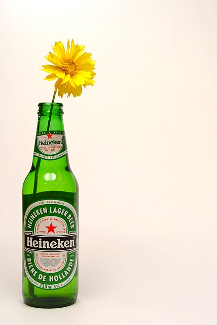
This bottle could be in the middle of the image. Don't overdoo the rule of thirds. The flower I Heineken will be in the right places vertically.
Exposure, focus & lighting are sopt on
Interesting idea and nice composition. The lighting is good, the product is prominent and the message is clear. You've even left room at the right for text. Very nice.
How does everyone get these perfect white backgrounds? Nice shot, would maybe work a little better if we could see liquid in the bottle. I like it, though.
Nice simple presentation with plenty of room for copy. Changing the background from the light peach color it currently is to white really improves this I think.
Awesome simplicity and composition. Pity about the uneven lighting on the background. Pure white with flat lighting would have made it better. Also the reflection on the botthle is a bit of a bummer yet I still love it.






 Add photograph to your favorites
 Add photographer to your favorites


