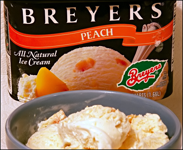
I wish the ice cream wasn't so blurry, because while I understand that breyer's is important, the ice cream in the foreground is the product. Still, I liked this photo.
This is a good idea. I like the layout. I think it might look a little better if there were another scoop of ice cream in the bowl, more like the box picture. Maybe even a peach slice.The ice cream in the bowl also looks a wee bit soft, lacks a little appeal. Maybe play with lighting to get rid of the shadow across the letters at top.
The ice cream is a bit out of focus. If you were to show more of the bowl of the ice cream, keeping both the bowl and the original container in sharp view, I think the photo would be much better.
I don't like the ice cream being out of focus in the front/center of the shot. It's a good choice otherwise. The inside of the bowl could use a little cleaning up as well, you don't see to many adverts with 'food mess' on the inside rim of a bowl, unless it is intentionally done to show how quickly and messily people gobble up the grub.
The lighting isn't to bad either, except for that one patch across the top of the word Bryers. If you had a directional light that could have been pointed 'up' at the lid of the ice cream container that might have disappeared.






 Add photograph to your favorites
 Add photographer to your favorites


 Photographer found comment helpful.


