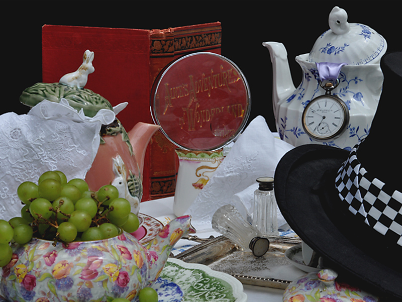
I like where you're going here, but the image is just a bit on the busy side for me - although in some ways I guess that goes along with the story - hmmmm, conflicted....
I like the idea and the setup looks good, but the overall image is rather flat and a bit soft. I think a little more exposure and DOF and it'd be halfway there.
There are no whites in this image. The brightest parts of this image are actually light grey. You can compare the brightest parts of this image to the background of DPC to see just how dark this image it. With so much detail, it would also be nice if it were sharper.
Great effort to collect all of the props from the book and nice arrangement, although composition is too busy as I had to search a bit to find the book, even with the magnifying glass. Lighting is adequate, but I find it too sterile.





 Add photograph to your favorites
 Add photographer to your favorites


 Photographer found comment helpful.


