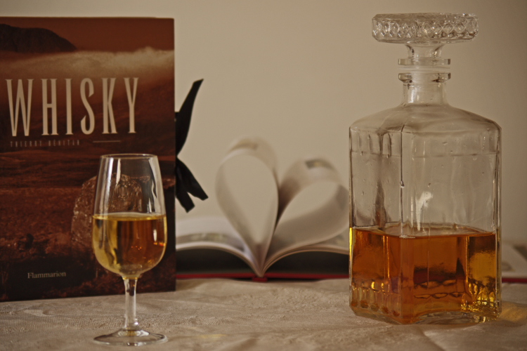
The background of this image should be white, but it's not. It's middle gray. That makes the image look dingy, which it not what you probably want to convey with wine and hearts. Some sharpening could also go a long way with this image.
Colors are good but lighting is a bit underwhelming and the composition static by putting the most interesting subjects at either end of the frame, making my eye jump back and forth.






 Add photograph to your favorites
 Add photographer to your favorites


 Photographer found comment helpful.


