Author Thread Comments Made During the Challenge
Post actions
Maybe the addition of a rag or other article would have added some interest?
Post actions
Post actions
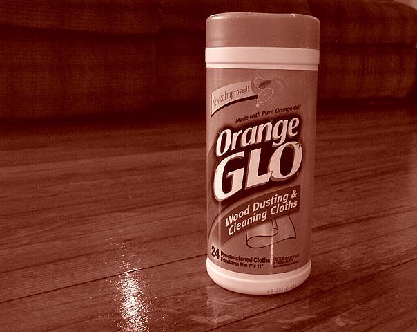
the refledtion on the floor indeed makes the wood glow. Nice idea. Needs to be rotated a bit CCW.
Post actions
Don't really like the sepia tone
Post actions
Duotone doesn't seem appropriate for this. Because of the name of the product, we really should see some orange (presumably in the label). The composition isn't bad. The product is a bit tilted.
Post actions
I dont think having the photograph all the same tone does it justice.
Post actions
I'm not sure I like the color tones in this photo. I would at least maintain the natural colors of the Orange Glo container, or give the whole photo a more saturated orange look to it. Great concept and angle, though.
Post actions
Would have been better if not in sepia.
Post actions
An advertisement for orange glo should probably have some vivid orange in it. So I'm not much for the color of the picture, but the setting is nice.
Post actions
Post actions
Should have made it more......well...orange
Post actions
...not sure why you took the colour out??
Post actions
Dont really like the sepia tone here. Takes away from what the product is supposed to accomplish.
Post actions
It looks like there is some dust or smudges right in front of the container. Otherwise it's a nice shot.
Post actions
Why duotone? You want people to identify your brand in the store, so make sure it looks the way it will when they go to the store. Nice wood grain.
Post actions
I think it would have been better full color.
Post actions
this is a gr8 picture goodluck!
Post actions
I like the colour. Probably I never see an advertisement in sepia, but I really love your pic... 7
Post actions
Too bad the hue isn't orangeish!!!






 Add photograph to your favorites
 Add photographer to your favorites


 Photographer found comment helpful.


