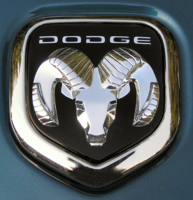
I never got the chance to comment on this during the challenge, this photo was great, its title hits home, nothing distracting to the pic, nice tight cropping...good job.
This is already an ad, you didn't actually create an advertisement. Anyway, the icon is not centered in the frame, and the left cheekbone is too bright, in fact many of the highlights are washed out. Photo appears grainy, but it could just be the logo is dirty.






 Add photograph to your favorites
 Add photographer to your favorites


