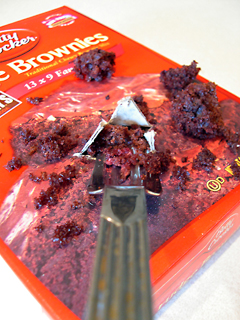
I like the idea behind this photo! I like the fork where it is...I think that it gives the onlooker the apeal that YOU are eating the brownie mix out of the package! Around the edges, the photo seems to be blurred. The photo could be more clear and concise!
Brownies should look much tastier than this. This looks rather yucky and unappealing. The fork seems to be the main subject which is not good for advertising. The viewer should be able to see the entire label of the product. The composition is just weird. After viewing it for a couple of minutes, I've only just realized that the fork is poking into a hole in the box. This foreshortened view was a bad choice. The cropping is far too narrow. The image itself is too small. Next time, take advantage of the 640 maximum DPC allows.
Very interesting idea. The hue and saturation of the box and the real brownies are such that the real brownes merge together with the box. Hard to tell the real from the box.







 Add photograph to your favorites
 Add photographer to your favorites

 Photographer found comment helpful.


